An ai company logo should be simple, symbolic, and scalable to signal trust and innovation.
Designing an ai company logo is more than picking a cool icon. It is how your brand speaks at a glance. I have helped AI startups grow from stealth to launch. In this guide, I share hard-won lessons, tested workflows, and ethical rules so you can build an ai company logo that is clear, legal, and built to last.
Understanding the ai company logo landscape
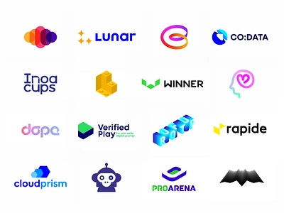
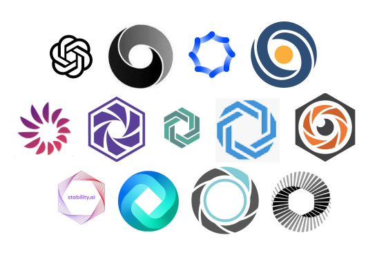
AI brands sit at the edge of tech and human value. Their marks often mix math-like shapes with warm, human cues. You see nodes, circuits, brains, or waves that hint at data and learning. You also see soft curves, white space, and calm colors that say trust.
Trends help, but they can age fast. Many AI marks look the same today. Your ai company logo must stand out while staying clear at 16 pixels. That takes intent, not luck. Start with meaning. Then use form to serve that meaning.
Color choices matter. Studies in color psychology show blue and teal suggest trust and logic. Purple can signal vision and creativity. Green hints at growth and ethics. Pick a palette that fits your promise and works on dark and light.
Strategy first: define the core of your ai company logo
A strong logo begins with simple answers. What do you do, for whom, and why it matters? Write this in one short line. That line guides design choices.
Define your tone. Are you precise, bold, caring, or playful? List three traits. They shape shape, color, and type.
Map your market. Note five rivals and their marks. Look for gaps you can own. Your ai company logo should claim one clear space in the mind.
Set success metrics. For example, 80% recall in a five-second test. Or a 10% lift in ad click rate when the logo is present. What gets measured improves.

Design principles that work for an ai company logo
Simplicity wins. A mark should read in a blink. Aim for one idea, not three.
Scalability is key. Your ai company logo must look sharp at 16 px and at 16 ft. Test both ends.
Clarity beats clever. If a viewer must decode it, it may fail in feed speed. Use clean geometry and a clear wordmark.
Distinctiveness drives legal strength. Avoid generic brains, hexagons, and nets unless you add a twist you can own.
Color with purpose. Use at most three core colors. Build a neutral set for UI use.
Type matters. Pick a typeface with good spacing and a clear x-height. Tune letter shapes for harmony with the icon.
Accessibility counts. Meet a 4.5:1 contrast ratio for core lockups. That helps all users in real life use.
Motion helps recall. Create a simple 1–2 second motion logo for product and video use. Keep it light and fast.
An AI-driven workflow: from prompt to production-ready vector
AI tools can speed the path. They do not replace taste or law. Use them to explore form fast and refine with care.
Here is a proven flow I use for an ai company logo:
- Write a brand brief. One line promise, three traits, two user pains.
- Craft prompts. Include shape cues, style, mood, and use case. Example: minimal geometric logomark, high contrast, works at 16 px, evokes secure learning.
- Generate sets with an AI logo or image tool. Create many, then shortlist five.
- Check originality. Search for near matches. Remove lookalikes.
- Vectorize the best idea in a pro editor. Clean paths. Remove extra nodes. Set a grid.
- Build the wordmark. Adjust spacing and curves. Test several weights.
- Make variants. Horizontal, stacked, icon-only, dark and light.
- Stress test. Favicon, mobile nav, slide deck, app icon, swag.
- Document rules. Clear space, misuse, sizes, and color codes.
Tools that help include AI logo generators, vector editors, and motion tools. Export master files as SVG and PDF. Export web assets as optimized SVG and PNG. Keep a source file for edits.
Tip from practice: AI outputs often have messy curves. I fix this by reducing anchor points and aligning handles. The mark then looks crisp at small sizes.
Legal, ethics, and ownership for an ai company logo
You need the right to use and protect your mark. Laws differ by place, so get legal advice. In many areas, a logo must be original to get trademark rights. Pure AI output may raise questions. Add human design input and keep records of your steps.
Do a clearance search. Look for same or close marks in your class. A clear search lowers risk and saves cash later.
Mind fonts and assets. Use licensed type. Keep proof. Avoid stock icons in your ai company logo. You want a unique mark you can defend.
Think ethics. Some generators train on broad datasets. Consider tools and settings that respect creators. This is good for brand trust and long-term risk.
Keep a process log. Prompts, sketches, edits, and dates. It helps show human authorship and intent.
Testing and validating your ai company logo
Test early and often. Small tests prevent big rework.
Use five-second tests for recall. Can people sketch your mark from memory? Ask what it suggests. The words should match your brand traits.
Check contrast and size. Ensure the icon reads at 16 px. Try it on a phone in sunlight. See if edges hold.
Run A/B tests. Swap old and new logos in ads or emails. Track click rate and lift. Keep the better one.
Look at cross-culture views. Words and shapes carry local meaning. Ask users in your key markets. Tune details if needed.

Deliverables and a scalable brand system
A good ai company logo comes with a full kit. This saves teams time and keeps your brand steady.
Make a logo pack:
- SVG and PDF masters for print and code-ready use
- EPS for legacy print systems
- PNG at 32, 64, 128, 256, and 1024 px
- ICO and SVG for favicons and app icons
- Mono and one-color versions for stamps and engrave
Add a color system:
- HEX, RGB, CMYK, and spot values
- Light, dark, and high-contrast sets
Add typography rules:
- Primary and fallback fonts
- Sizes and spacing for web and slides
Add usage rules:
- Clear space and minimum size
- What not to do
Add motion:
- A short intro and outro logo
- Lottie or lightweight video for apps
Wrap all in a simple brand guide. Keep it under 20 pages. Make it easy to follow.
Costs, timelines, and smart budgeting
Costs vary by method. An AI logo generator can be low cost. A senior designer or studio costs more but brings depth. The right choice depends on risk, stage, and goals.
Typical ranges I see:
- AI generator with light human polish: fast and low cost
- Freelancer with strategy and custom work: mid cost
- Studio with research, testing, and system: higher cost
Time spans from one week to six weeks. Rushing adds risk. Your ai company logo will live for years. Spend enough to get it right once. Track return with recall, trust surveys, and funnel metrics.

Common mistakes to avoid with an ai company logo
Do not chase trends. Many AI marks use the same brain or hex icon. Stand out with a unique form.
Do not skip small-size tests. A fancy mark that fails at 16 px will hurt you.
Do not ignore legal proof. Keep prompt logs, sketches, and license receipts.
Do not pick low contrast. Ensure it works on light and dark with strong edges.
Do not over-animate. Motion should be quick and clear, not a show.
Frequently Asked Questions of ai company logo
What makes an ai company logo different from a typical tech logo?
An ai company logo signals learning, data, and trust in one simple mark. It often uses clean geometry and calm color to reduce fear of complex tech.
Can I trademark an AI-generated logo?
Yes, if it is distinctive and tied to your goods or services. Add human design input and document the process to strengthen your case.
How do I ensure my ai company logo is unique?
Run image and trademark searches before you commit. Change shapes, angles, and type until the form feels fresh and ownable.
What colors work best for an ai company logo?
Blue and teal suggest trust and logic, while purple can signal vision. Pick colors that fit your brand and pass contrast checks.
Which file formats should I get from my designer?
Ask for SVG and PDF masters, plus PNG sizes and an ICO or SVG favicon. You also need mono versions and a style guide.
How long does it take to design an ai company logo?
A lean process can take one to two weeks. A full process with tests and a brand kit can take three to six weeks.
Conclusion
A strong ai company logo blends clear strategy, simple form, and legal care. It must read fast, scale well, and hold meaning that lasts. Pair AI speed with human taste and proof of originality to build trust.
Start today with a one-line brand promise and three traits. Test small, refine fast, and ship with a clean kit. Want more help? Subscribe for templates, or share a link to your draft logo for feedback.
Leave a Reply